Friday, February 17, 2006

Review: The Ultimate Avengers Movie

marvel comics

You saw the promotional screenshots and you despised them.

You downloaded the trailer and you feared the worst for the movie.

You re-read the TPB and speculated about Millar and Hitch and how they may have become frustrated with the evolution (or should that read as “devolution”) of their comic book masterpiece.

Now, the DVD has arrived, and guess what? Your fears have come true… which is a good thing. Read on, true believer, as this review would discuss the dichotomy that is the Ultimate Avengers movie.

Ultimate Expectations

Let’s face it. Even if you are a devout DC fan, you have to admit that Mark Millar and Brian Hitch’s run on the Ultimates is nothing short of a masterpiece. They have the widescreen in mind in their storytelling and the layouts of their pages. Even the characters were re-imagined to correspond to the Hollywood celebrities they desire for the roles.

People can’t help but expect the best from the announced movie.

But when it was announced that the movie would be a cartoon, the a priori disappointments started. The Ultimates wasn’t meant to be a cartoon. It was meant to be a summer blockbuster flick!

Then the name. “Ultimate Avengers” is not really logically sound. The storyline is about the formation of the Avengers. They are the first group. The word “ultimate” is comparative. We can’t compare this team with any other incarnation. So why Ultimate Avengers? Yes, the decision was made to attract the fans of both the 616 and the Ultimate universes, but hey… they could have called it as “The Ultimates” or “The Avengers” and their target market would have been able to recognize them, either way.

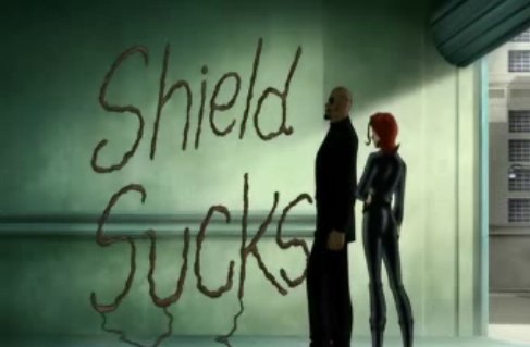
Then the screenshots. By Odin’s beard, were they ugly! They looked like amateurish cartoons outsourced from a sweatshop somewhere.

The trailer didn’t do much for the movie as well. Inappropriate voice acting, jerky motions and dull animations were just some of the concerns people aired a few days after it was offered for download.

Nonetheless, a lot of people eagerly awaited the DVD’s release. Despite the seeming flaws of the movie, countless comic book and cartoon fans waited impatiently for the first complete look at the Ultimate Avengers.

Ultimate Review

This review is about the movie only. DVD extras are not included (sorry folks).

That being said, guess what?

I wasn’t disappointed!

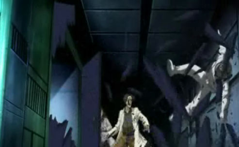
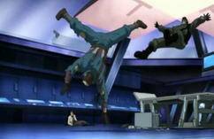
The movie clocked in at 71 minutes. It was a fast 71 minutes at that, as action never seemed to stop. The screenshots, the trailers... they never did this movie any justice.

Surely, you’ve watched better animated films before. But Ultimate Avengers is not bad, by any means. The integration of some computer generated effects was seamless. The art was consistent all throughout.

marvel toys

ultimate avengers

ultimate avengers

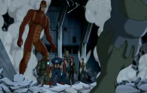
Marvel Films hyped the opening scene, taken from Ultimates Vol. 1, No. 1, as a powerful opening worthy of comparison to Saving Private Ryan and Lost. Well, that’s an exaggeration, but the said opening scene did serve its purpose, and in my opinion, was the best animated moments in the movie.

marvel comics

Voice acting was spot on. Hank Pym sounded like a self-absorbed jackass. Thor sounded like a radical hippie. Tony Stark sounded like the playboy-billionaire that he is, while Iron Man’s voice was technologically altered by his armor. Black Widow (yes, she’s in the film!) sounded Russian enough. Bruce Banner sounded like a fan boy geek.

black widow iron man

The only problems with the voices are Captain America’s and Nick Fury’s. Cap’s was a little too much on the innocent side. You won’t hear him shout things like “What are you waiting for? Christmas?” or “What do you think the A on my forehead stands for? France?” in this movie. He sounded rather timid majority of the film. Nick Fury, well, I just expected him to sound, and act, like Samuel L. Jackson. He did not. And neither was he as manipulative and heartless as his comic book version, either in the 616 or the Ultimate Universe.

The story was adapted well. It should’ve been based on the first 6 issues of Ultimates, Vol. 1, but some story points in the second half of that volume made their way to the movie. Black Widow being one of them, the aliens another.

Other than these two points, everything else is relatively consistent to the story arc from which it was based. There are some creative deviations, of course, but nothing too serious.

when will the toys come out?

Ultimate Differences

Here are the differences between the Ultimates comic book and Ultimate Avenger:

• Tony Stark did not fund the Avengers. In fact, no one knows that he and Iron Man are one and the same, at least, not initially.

• Thor doesn’t have a beard. But he did have some unintentionally funny lines.

• There were clues about Hank and Janet’s marital problems, but they weren’t explored further.

• Cap and Fury went out on a recruiting expedition, instead of having the Avengers, well, assembled when Cap was revived from his cryogenic state.

• The Avengers had a prior mission before the Hulk fiasco. It didn’t fare well.

• The Iron Man armor is a combination of the 616 and the Ultimate versions.

• Understandably, the movie is less violent than the comic book. But the film also had its share of kid-unfriendly moments.

Great lines:

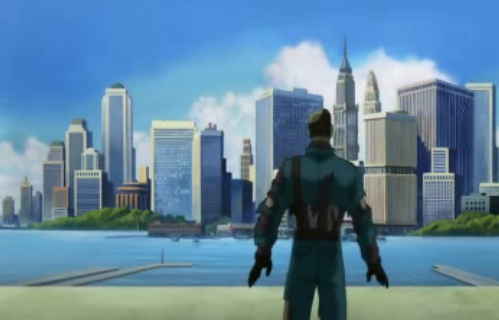
• When Cap awoke from his slumber and went on a rampage, only to realize that he is at the outskirts of New York City, he asked Fury, “did we win?” Fury said, “yes, we did.”

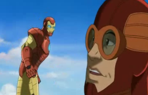
• When Iron Man and Giant Man met for the first time, Tony remarked, “nice costume.”

are you from texas?

The movie is a relatively faithful adaptation of the source material. It’s no LOTR. More like Pet Cemetery, where the movie was scary but the book was a whole lot scarier.

Ultimate Choice

At its core, this movie is about a man out of time and the guy who worshipped him. Captain America is the real deal. Bruce Banner wanted to become the real deal, and had to pay the price for his choices.

talk about a man crush

But is Ultimate Avengers worth the purchase?

From a guy who shared your sentiments prior to the movie’s release, I would say yes. The technological aspects of the film may be underwhelming, but in the end, you’ll feel that it was made with a lot of heart.

I can’t even believe that I’m actually excited about the sequel right now.

millar and hitch deserve royalties

Wednesday, February 15, 2006

Review: Astonishing X-Men Wolverine Mini-Bust, by Diamond Select

Image hosting by Photobucket

Released this week is the 6th installment of Diamond Select’s Astonishing X-Men line of mini-busts, featuring everyone’s favorite (because of overexposure) Canadian feral berserker, Wolverine.

For those who have been following this line, you’d know that the Astonishing X-Men mini-busts have been nothing but, well, astonishing. From the wonderful details in their tiny structure, to the perfect expressions they portray, to the amazing paint jobs they possess, this is THE series of mini-busts that could actually compete with Bowen Designs’ consistently stellar offerings.

How Does Wolverine Fare Against The Other Busts In The Series?

Pretty good, if I may say so.

The sculpt is great. Every ripple of his muscles is captured in vivid detail. Proportions are perfect. Veins extrude quite dramatically. Plus, there are so many delightful extras with this installment.

The sculpt is a given. Jeff Feligno is known as one of Diamond Select’s elite craftsmen, and anything he touches turns out beautifully.

Besides, with the pedigree established by its five predecessors, namely Shadowcat, Beast, Colossus, Cyclops, and Emma Frost, we couldn’t possibly expect anything else with this Wolverine bust.

Image hosting by Photobucket

Which turns out to be its undoing, however.

Though the sculpt is great, it is quite underwhelming when compared to the others from the same line. It is not the sculptor’s fault, though. There is only so much you could play with when it comes to Logan’s new gear. He doesn’t have a pet dragon, nor blue fur, nor Slim’s commanding pose, nor Emma’s beautiful bust... really... that White Queen mini-bust is a masterpiece!

The pose that the bust tried to convey didn’t work for me, as well. A lot of collectors were actually turned off when preliminary pictures of this installment were released, primarily because the details aren’t really apparent. But those concerns would be laid to rest once they see the finished product, that’s for sure. This mini-bust packs a wallop, regardless of the pose. It’s just that I personally believe a more dynamic and, dare I say, cooler position could have been chosen. Nonetheless, it’s a production decision which does not take away from the craftsmanship of the piece.

Image hosting by Photobucket

Perfect Paint

The paint job is excellent. Not a single abhorrent coloring can be seen. Everything is in order, just like a computer-colored comic book panel. The hues of the paints are dark enough to convey Logan’s feisty nature despite his seeming preference for sunny colors.

Image hosting by Photobucket

Diamond Select Vs. Bowen Designs; Accuracy Vs. Functionality

In my opinion, the main difference between Diamond Select and Bowen Designs when it comes to their respective portrayal of Marvel characters boils down to a matter of accuracy vs. functionality.

Diamond Select chooses to take the more comic book-faithful route. They design their pieces as accurately as possible, based on how they appear in their books. This Wolverine mini-bust, for example, was based on John Cassaday’s pencils, and it shows. Looking at him would be like looking at a comic book page.

Image hosting by Photobucket

This becomes a disadvantage, however. Some costumes are made to look cool in comic book pages, compromising believability more often than not. This Wolverine mini-bust is just like his comic book counterpart. Though that’s a good thing, it’s also something bad. The placement of the mask seems off. The claws seem longer than how they should appear. And I never really dug Wolverine with fangs. He’s a berserker, yes, but never a vampire (save for that instance when he was possesses by a Brood, but we digress).

Bowen Designs take some liberty to adjust the costumes and make them more believable. Try to look at the condom-shaped head of a full size Deadpool statue, for example. Better yet, the more humanlike physique of their Venom.

This is merely a matter of preference, however.

So, About The Wolverine Bust...

My first concern was the claws. They seemed so fragile! They’re quite sturdy, however. My guess is that they’re made of aluminum laced with ceramic. They’re bendable, so if they manage to bend a little, you could gently pull them back to how they should be.

Now, here’s what I believe is the worst part about this piece... Wolverine would make you lose some sleep!

Not because of the joy brought by his acquisition, mind you, though some may profess such bliss.

It’s because Wolverine has problems standing. Yes! The base cannot support the bust well. A breeze could make it fall. A slight bump of your display cabinet would make it tumble forward.

This is such a disgrace. It could have been avoided by simply adding two extensions on the base at the front side of the same. Yet, Diamond Select failed to correct this oversight. It’s been merely 3 weeks since the wonderful, wonderful Emma Frost bust was released. Why were they in such a hurry to distribute this one?

So here are some safety tips:

• Place Wolverine at the back side of your display cabinet, so that when he tumbles forward, he won’t fall off the edge.

• Do not place another piece in front of Wolverine, so that he may not be able to push that piece whenever he falls.

• Make sure that your display cabinet has a glass window to break the eventual fall. Yes. I said “eventual.” Wolverine would tumble forward eventually.

Image hosting by Photobucket

Wolverine is in scale with the rest of the Astonishing X-Men, with the exception of the White Queen, which was a little too big for this line.

The claw marks on the base are a nice touch. Definitely adds character to the bust.

Image hosting by Photobucket

All in all, I’m very happy with this purchase. It completes the astonishing Astonishing X-Men line, and it concludes the series on a high note.

Image hosting by Photobucket

Well, it’s not really the end of the series, as Danger, their main nemesis in issues 7 to 12 of the comic book series, would be made into a mini-bust as well. But who cares about her, right?

Review: Identity Crisis Series I, Hawkman

comic collectibles

The most expensive DC Direct figure has always been Hawkman. Together with Hawkgirl in a deluxe set released some 4 years ago, Hawkman is valued at $150 in the secondary market. Loose figures of this DC Universe icon sell for as much as $50, effectively making him beyond the reach of casual collectors.

That is until today, when Identity Crisis Series I finally hit the market after a 4 month delay.

A Michael Turner-inspired action figure, Hawkman will most certainly be a sellout with most retailers, much like how the Secret Files Unleashed Martian Manhunter quickly disappeared from the shelves last month. This is a collector’s second chance to bag an important piece to complete the Satellite Era JLA incarnation.

The Packaging

The packaging is attention-grabbing, to say the least. Since this is an artist-specific line, Michael Turner’s art from DC’s revolutionary mini-series grace the card in explosive glory. There are no borders on the card, making it seem that an actual comic book is supporting the figure.

comic toys

This is a nice touch. DC Direct has not really been known for its packaging wizardry. Often, they rely on the strengths of their figures. Nothing has changed with this release, but at least, the card is colorfully striking.

The Sculpt

This Hawkman version isn't really one of DC’s best sculpted figures. Granted that the sculpt is based on Michael Turner’s rendition of the character, the body leaves a lot to be desired. It is given that there will be some problems with proportions, given the artist’s propensity to disregard basic anatomy, but the figure’s body is cleanly sculpted… too cleanly in fact that it cannot hide its plastic material. It’s not bad, though, I just expected more from the delay in the release of this line.

comic book toys

The face, however, is a wonderful creation. Hawkman’s scowl captures his intense disposition. The wings on his helmet are perfectly carved with great details. The beak protrudes perfectly, much like his comic book counterpart.

Hawkman is also perfectly in scale with most of the DC Direct figures. He’s just as tall as Martian Manhunter.

action figure

action figures

Articulation

Fabulous! Considering DC Direct’s frugal nature when it comes to articulation, Hawkman blesses us with more than what we may have expected.

Ball-jointed neck, ball-jointed shoulders, elbow articulation, knee-articulation, and… hold your breath for this one… wrist articulation as well!

comic collectibles

DC has remained adamant about waist articulation, however, and none can be found here.

Accessories

Hawkman comes with his trademark mace. Nothing special, but good enough to be comic book-accurate.

Of course, Hawkman won’t be Hawkman without his wings. His wings, in this figure, are completely detachable. They come with ball-shaped edges that can be inserted in the two holes on his back. The result? Articulated wings!

identity crisis toys

His wingspan, however, is not what you would expect if you were to use the comic books as gauge. They’re rather small, but believable enough. Their size, however, eliminates balancing issues. This figure has no problems standing up, even without the stand.

Speaking of the stand, this figure comes with one which is generic to all the figures in the line. It is an oval stand with the logo of the comic book from which the figure was based.

comic toys

Paint Application

The figure perfectly captures the character’s comic book colors.

However, the very first thing you will notice about this Hawkman version is the color application on his mask. They’re totally different from what was solicited. Whereas preview pictures showed the mask to have a dirty yellow color, the figure has a black front, yellow and red eyebrows, and a red beak. When I first saw it, I was shocked. I wonder what effect DC Direct was trying to effectuate with this color scheme because it didn’t work for me.

comic collectible

Nonetheless, it’s something that grows on you. Chances are, you won’t notice it after a few minutes.

Or hours.

Or days.

The Bottom Line

There were reservations about this wave. When the solicitations first appeared, people claimed that they’re the ugliest figures DC Direct has ever produced. Many even believed that Michael Turner’s art doesn’t translate well when sculpted (as was the case with the Flash Vs. Gorilla Grodd statue where the base was actually more beautiful than the centerpiece).

There were also some complaints about Michael Turner’s choice as the artist for the action figure series. Michael Turner only sketched the covers of Identity Crisis, and Rags Morales penciled the interiors. A lot of fans believed that the latter artist should have been given the honor to have a line dedicated to his art.

Given these preliminary concerns, I am proud to report that the Hawkman figure would silence the critics. It is a good figure, and a great alternative for those who failed to get the original release.
As for the other figures in this series, it seems that they will also surpass expectations. This is a rare case where the actual figures actually look better than the preview pieces